Every Layer on the RPAS WILCO Map, Explained
A layer-by-layer guide to the RPAS WILCO airspace map — what each colour means, which layers are on by default, and how to open a feature to see exactly what you are flying into.

Most drone pilots learn one colour on an airspace map — red means stop — and fly on that alone. The RPAS WILCO map has nine layers and eight distinct colours, and each one answers a different question about the site you are about to fly.
This guide walks through all of them: what turns a polygon red instead of amber, which layers start switched off, and where to click when you need to know what a specific shape actually is rather than what colour it is.
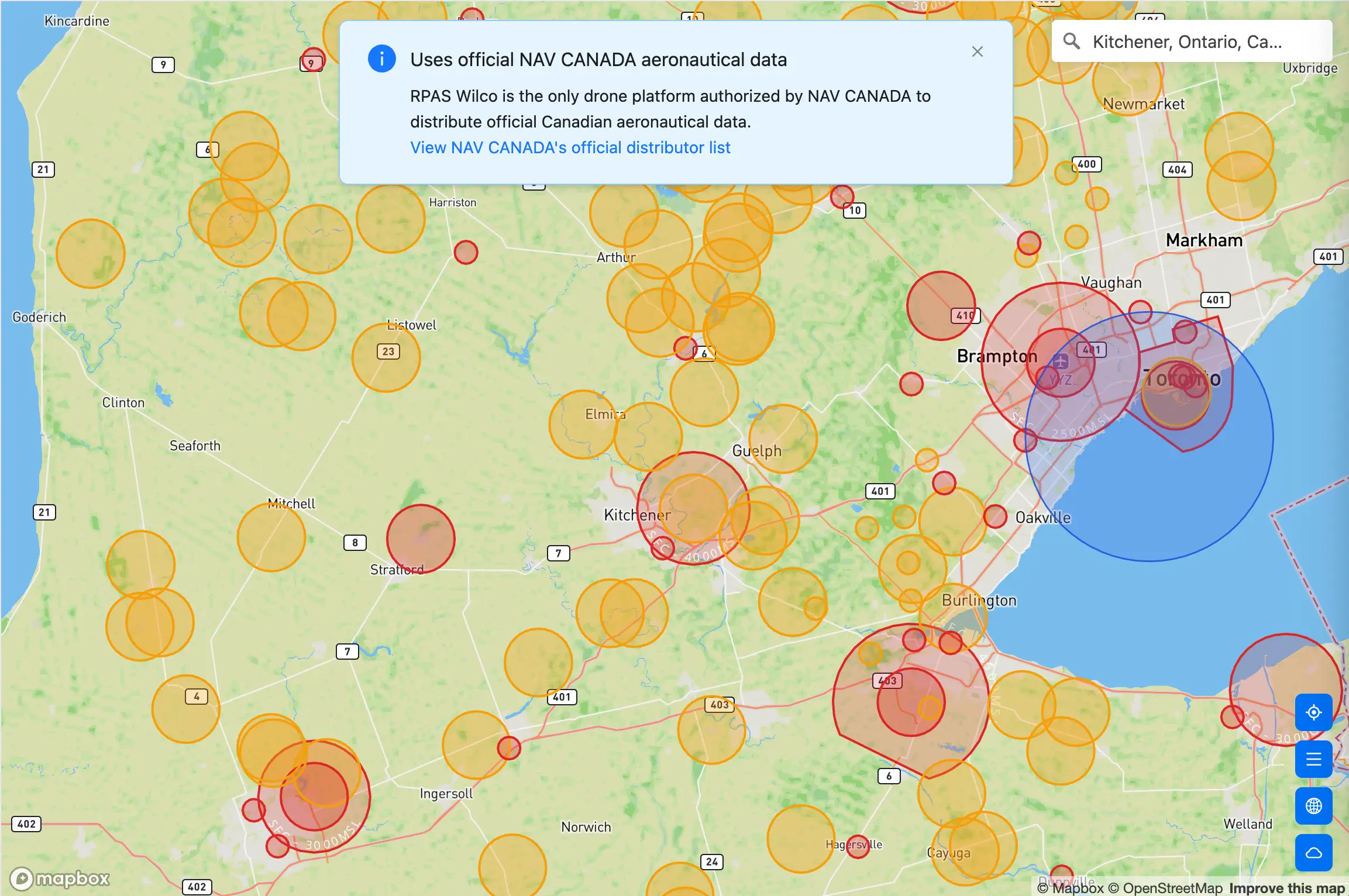
The map on first load. Airspace and aerodromes are already on.
Where to find it
- Web — sign in and click Map in the left sidebar
- Mobile — the Map screen is the app’s home screen
There is also a free, sign-in-free version at map.rpaswilco.com if you only need a quick airspace check. We cover that separately in our guide to the free drone airspace map.
Official data, layer by layer
The banner at the top of the map is not decoration. RPAS WILCO is an authorised NAV CANADA aeronautical data distributor, which means the airspace boundaries, aerodrome records, NOTAMs, and VNC/VTA charts you see are the source data — not a third-party approximation traced from a screenshot. Our post on why NAV CANADA data matters explains why that distinction changes your risk profile.
The map layers that are not aeronautical data come from their own authoritative sources, and it is worth knowing which is which:
- Airspace, Aerodromes, NOTAMs, VNC/VTA charts, CFS — NAV CANADA
- Active Wildfires — Canadian Wildland Fire Information System (CWFIS)
- Population Density — Statistics Canada dissemination areas
- National Parks — NRCAN CLSS / Parks Canada
How to read the legend
Open the legend with the menu button in the bottom-right stack. It has two halves, and the distinction between them matters.
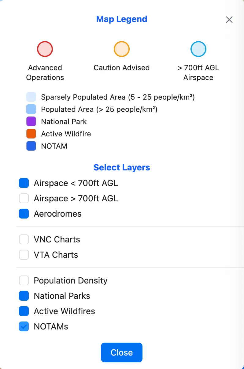
The legend. Colour meanings at the top, layer switches at the bottom.
The top half explains colour. Three circles:
- Advanced Operations (red) — airspace that reaches the ground, plus certified aerodromes. This is where you are most likely to need authorisation before you launch.
- Caution Advised (amber) — the remaining aerodromes and heliports. Not necessarily prohibited, but there is aviation activity here you need to account for.
- > 700ft AGL Airspace (light blue) — airspace that starts above the surface. Informational for most drone work, which is why it is off by default.
Five swatches follow, for the layers that are not airspace: sparsely populated areas, populated areas, national parks, active wildfires, and NOTAMs.
The bottom half, under Select Layers, is where you switch the nine layers on and off.
Here is the important part, and it is the thing most pilots miss: the legend tells you what a colour means, never what a specific shape is. A red circle on your screen could be a control zone around a certified aerodrome or a restricted area with a phone number you need to call. The legend cannot tell those apart. For that, you click the shape — see Click a feature below.
The nine layers
Airspace < 700ft AGL — on by default
Red fill and outline, with a FLOOR - CEILING label along the boundary. This layer holds every airspace whose floor is the surface — meaning the restriction applies from the ground up, at every altitude you are likely to fly.
That is the whole reason it is on by default and the reason it is red. If a red polygon covers your site, it applies to you.
Click any polygon and the label resolves into real values. On this layer the floor is always SFC — a surface floor is the filter that defines the layer. It is the ceiling that varies, and it arrives as a number plus a reference datum: AGL above ground, MSL above sea level, STD for standard-pressure flight levels. Floors that sit above the surface — 700AGL, 2500MSL and the like — belong to the > 700ft AGL layer described next.
The airspace class is not encoded in the colour. Red here means “the floor is the surface”, nothing more — the class itself is the first row of the detail panel when you click the polygon.
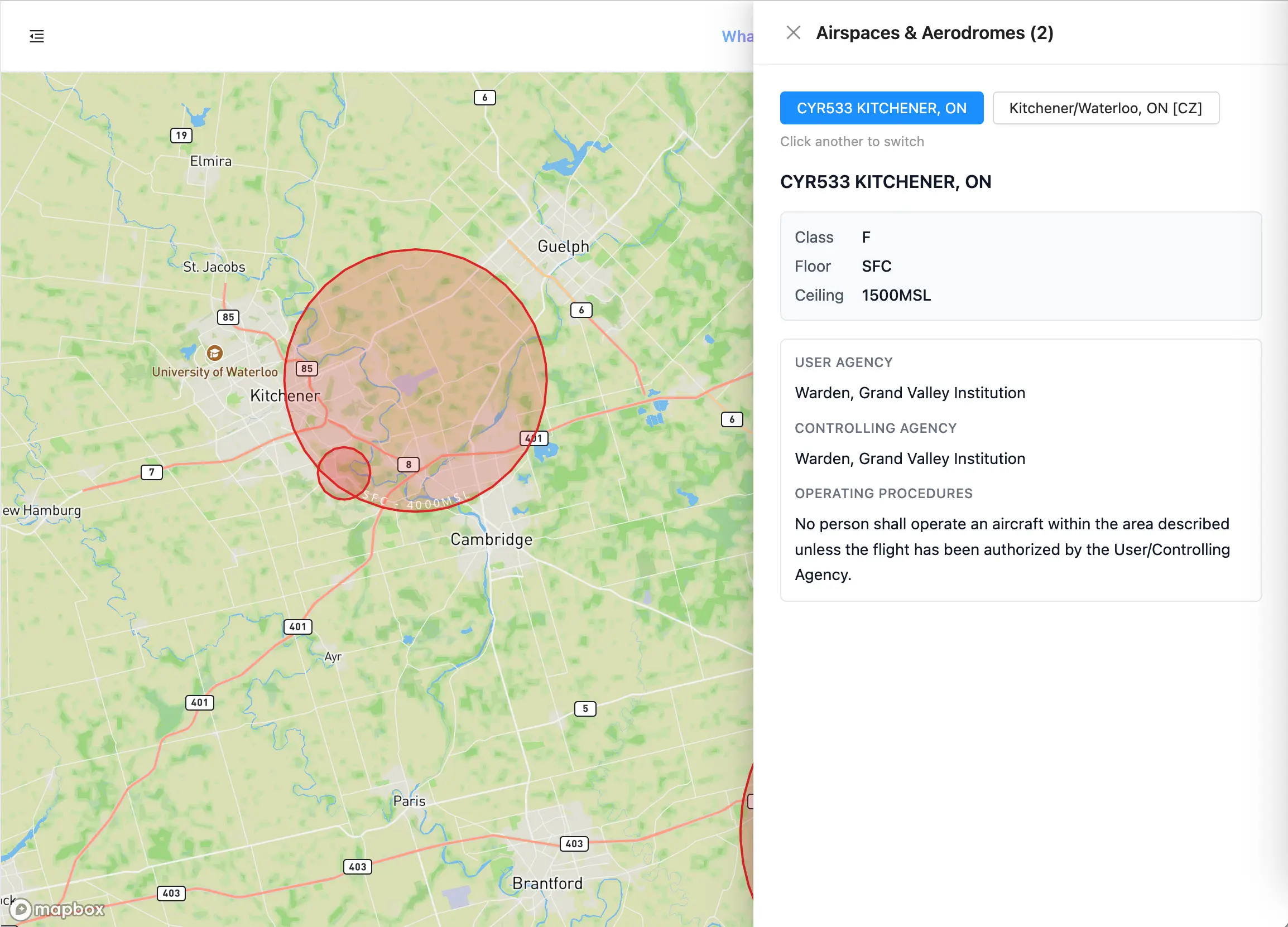
Surface airspace. The boundary label carries the floor and ceiling.
Airspace > 700ft AGL — off by default
The same airspace collection, filtered the other way: everything whose floor sits above the surface. Light blue, same boundary labelling.
For most RPAS work this is context rather than constraint — it is the airspace stacked above you. Turn it on when you are planning something at altitude, or when you want to understand the structure of the airspace around a site rather than just the part that touches the ground.
Aerodromes — on by default
This is the layer where the red/amber split is easiest to misread, so be precise about it.
Aerodromes are drawn as filled circles, coloured by their operator type:
- Red — certified aerodromes and those flagged
Mil - Amber — everything else, including registered aerodromes,
NA, andDND-operated sites
Note that last point carefully: a DND operator type renders amber, not red. Do not use colour alone to decide whether you are near a military field — open the feature and read the operator.
The layer covers more than runways — an aerodrome record is not always a runway, and each record carries its own site type next to the certification badge when you open it. Heliports are also fetched as their own sub-layer, though they are only rendered for MAAC accounts.
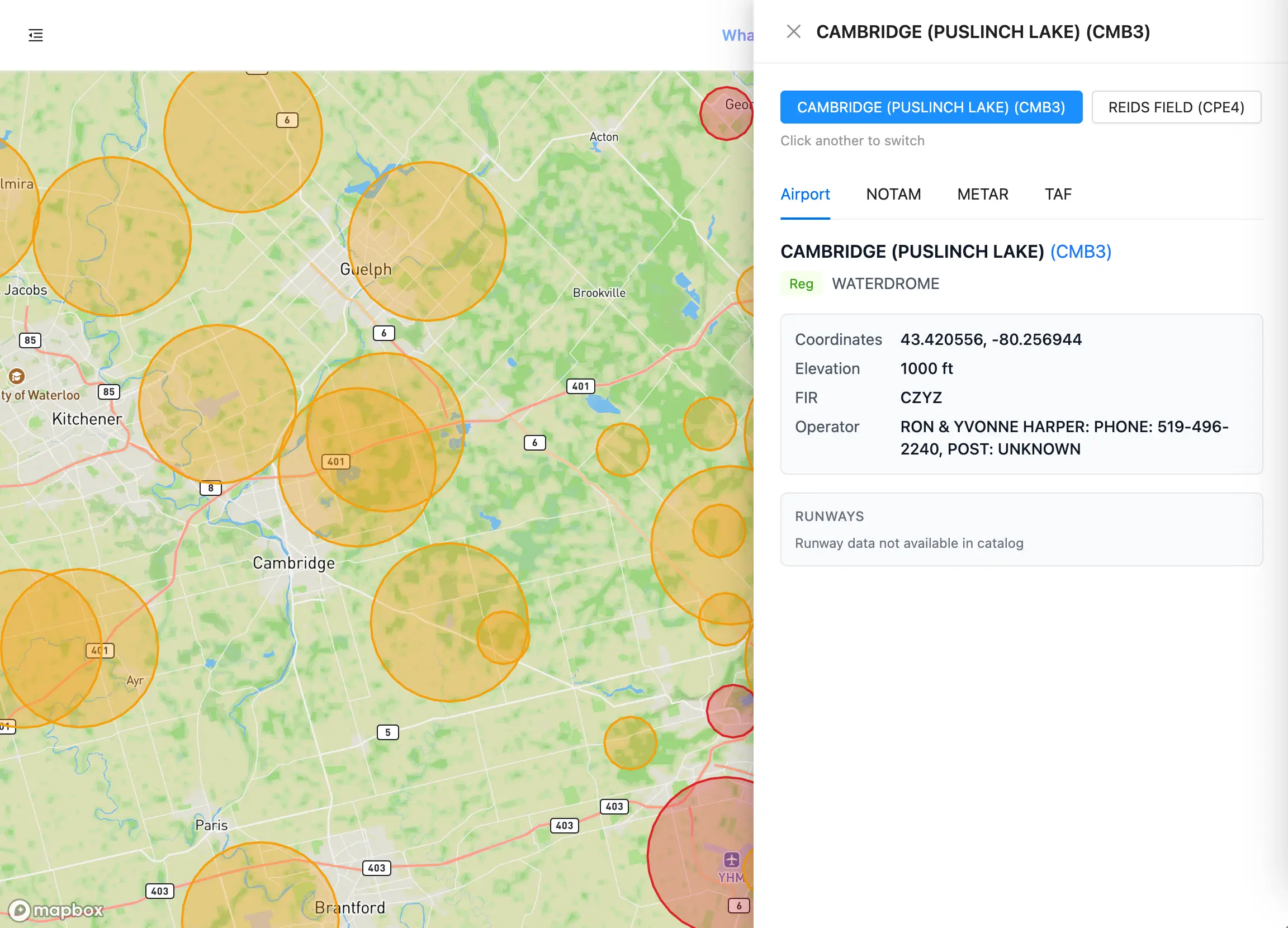
Red is certified. Amber is everything else — check the operator before assuming.
VNC Charts — off by default
Visual Navigation Charts, rendered as a raster overlay beneath the vector layers so airspace boundaries stay readable on top. These are the same charts manned pilots use, and they carry terrain, obstacles, and navigation detail that no polygon layer conveys.
VNC charts are published as separate sheets, each with its own coverage area — which drives the behaviour below.
One behaviour worth knowing: a chart only draws when the centre of your map sits inside that chart’s coverage area. Pan toward the edge of a sheet and the overlay will disappear even though you can still see the region it covers. Re-centre and it comes back.
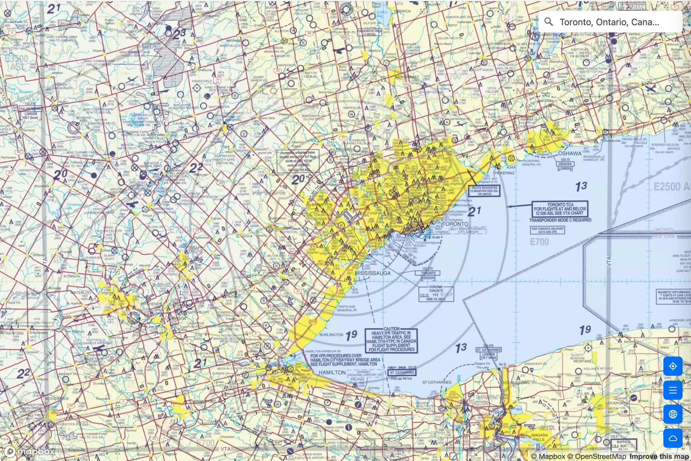
VNC overlay. Airspace vectors stay on top of the chart.
VTA Charts — off by default
Visual Terminal Area charts — the high-detail sheets for busy terminal airspace. Coverage is limited to the major terminal areas, so outside a VTA sheet’s footprint the toggle has nothing to draw.
If you fly commercially inside one of those terminal areas, this is the most information-dense layer on the map.
Population Density — off by default
Statistics Canada dissemination areas, shaded in two blues:
- Pale blue — sparsely populated, 5–25 people per km²
- Medium blue — populated, more than 25 people per km²
This layer answers a question the airspace layers cannot: what is underneath you. Ground risk drives a large share of operational requirements, and “rural” by eye is not the same as sparsely populated by census data.
It renders underneath every other vector layer, so it never obscures an airspace boundary. Only the VNC and VTA chart rasters sit below it.
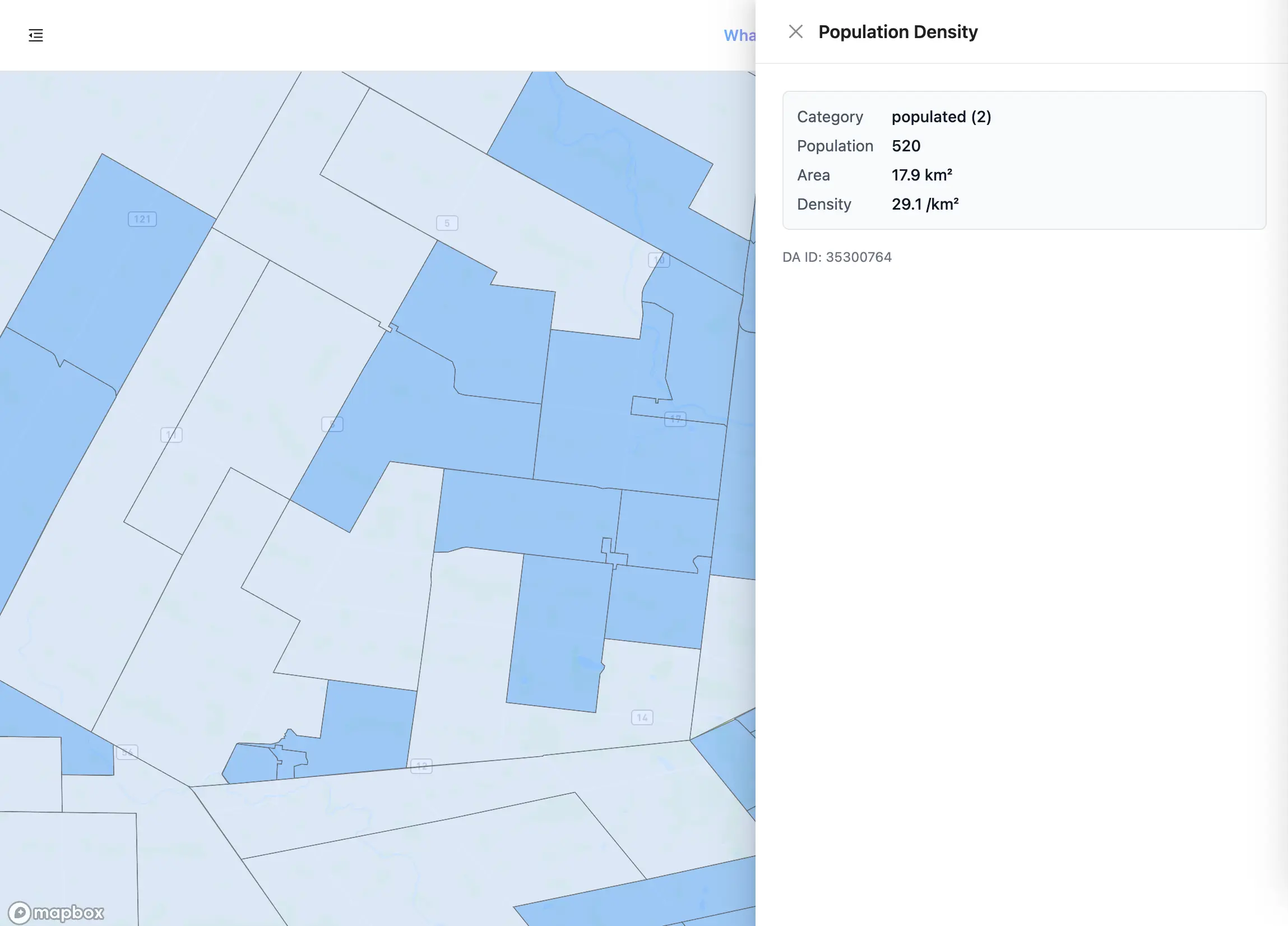
Population density. Pale is sparse, medium is populated.
National Parks — off by default
Purple fill covering Canada’s national protected areas. The layer includes four designations: National Parks of Canada, National Park Reserves of Canada, the Saguenay–St. Lawrence Marine Park, and Rouge National Urban Park.
Parks matter to drone pilots for reasons that have nothing to do with airspace — they carry their own operating restrictions, and the answer to “can I fly here” usually comes from the park office rather than from an aeronautical chart. Which is why the detail panel for this layer carries the park’s own contact details — phone, toll-free line, email, and mailing address — rather than airspace values.
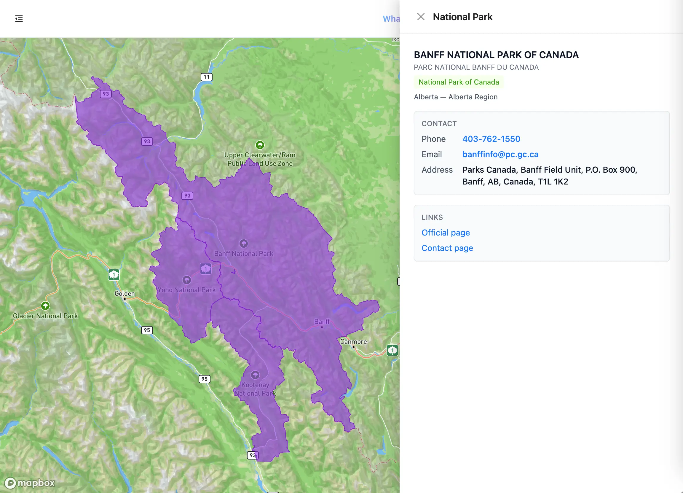
National park boundaries. Purple, with the park’s contact details where Parks Canada publishes them.
Active Wildfires — on by default on web, off on mobile
Orange fill with a darker outline. Perimeters come from CWFIS on a scheduled server-side refresh, and the map re-fetches them for wherever you have panned to.
Wildfire perimeters are one of the fastest-moving hazards on the map and one of the most consequential — aerial firefighting operates at low level, and drone incursions ground those aircraft.
Note the platform difference: this layer starts on in the web dashboard and off in the mobile app. If you move between the two, check the toggle rather than assuming.
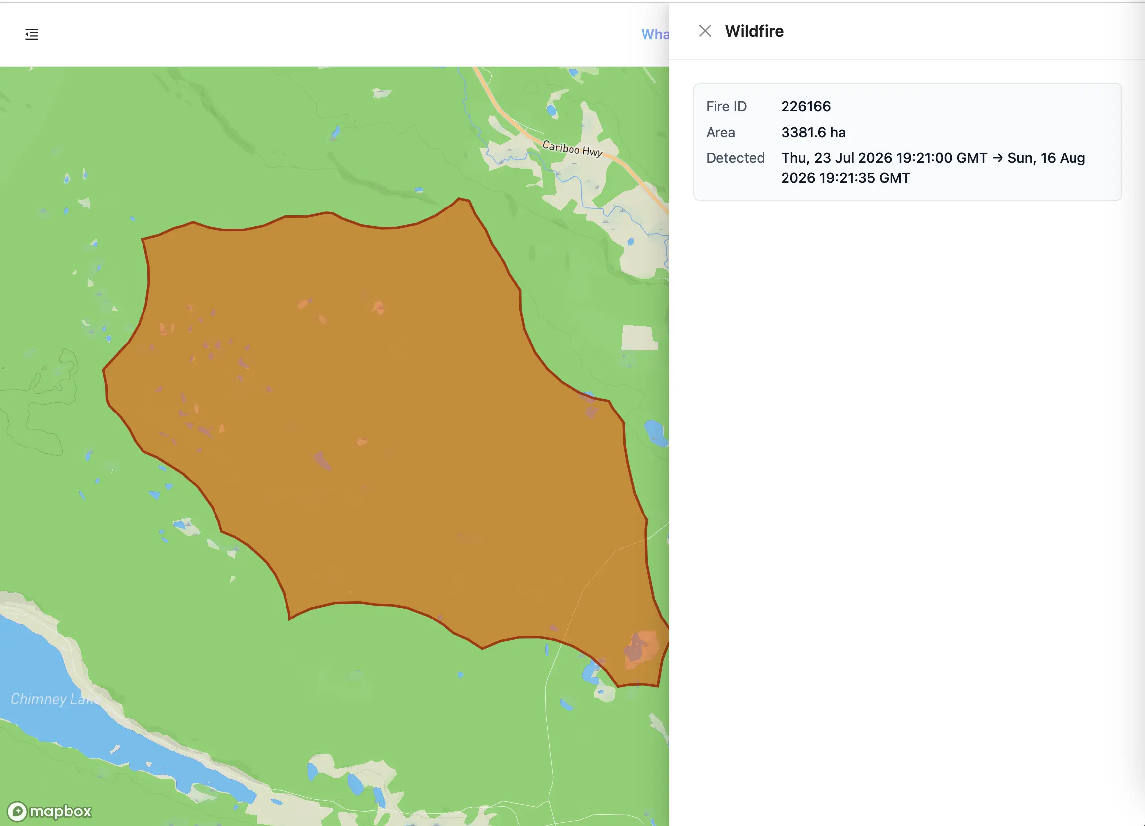
Active wildfire perimeters, sourced from CWFIS.
NOTAMs — off by default on web, on by default on mobile
Blue polygons for area restrictions and blue dots for notices too broad to draw as a meaningful circle. The fill is deliberately more transparent than the wildfire layer so that overlapping notices stay legible.
Two things to understand about this layer:
It shows restriction NOTAMs only. The map filters to the restriction subset rather than rendering every notice category. If you need the complete NOTAM picture for a site — runway closures, lighting, navigation aids, and the rest — that lives in the site survey report, not on the map.
It shows currently-active notices only. Expired and not-yet-effective NOTAMs are filtered out server-side, so what you see on the map is in force right now. A notice with no defined end date is treated as open-ended and always shown.
If the coded format is unfamiliar, our guide to decoding NOTAMs walks through it field by field.
NOTAMs. Polygons are area restrictions; dots are wide-scope notices.
Click a feature to see what it actually is
Colour narrows things down. Clicking identifies them.
Click any polygon, circle, or dot and a panel opens on the right with that feature’s full record. If several features overlap at the point you clicked — which is common, since a site can easily sit inside an airspace, near an aerodrome, and under a NOTAM at once — the panel shows a row of chips across the top, one per feature, with the hint “Click another to switch.”
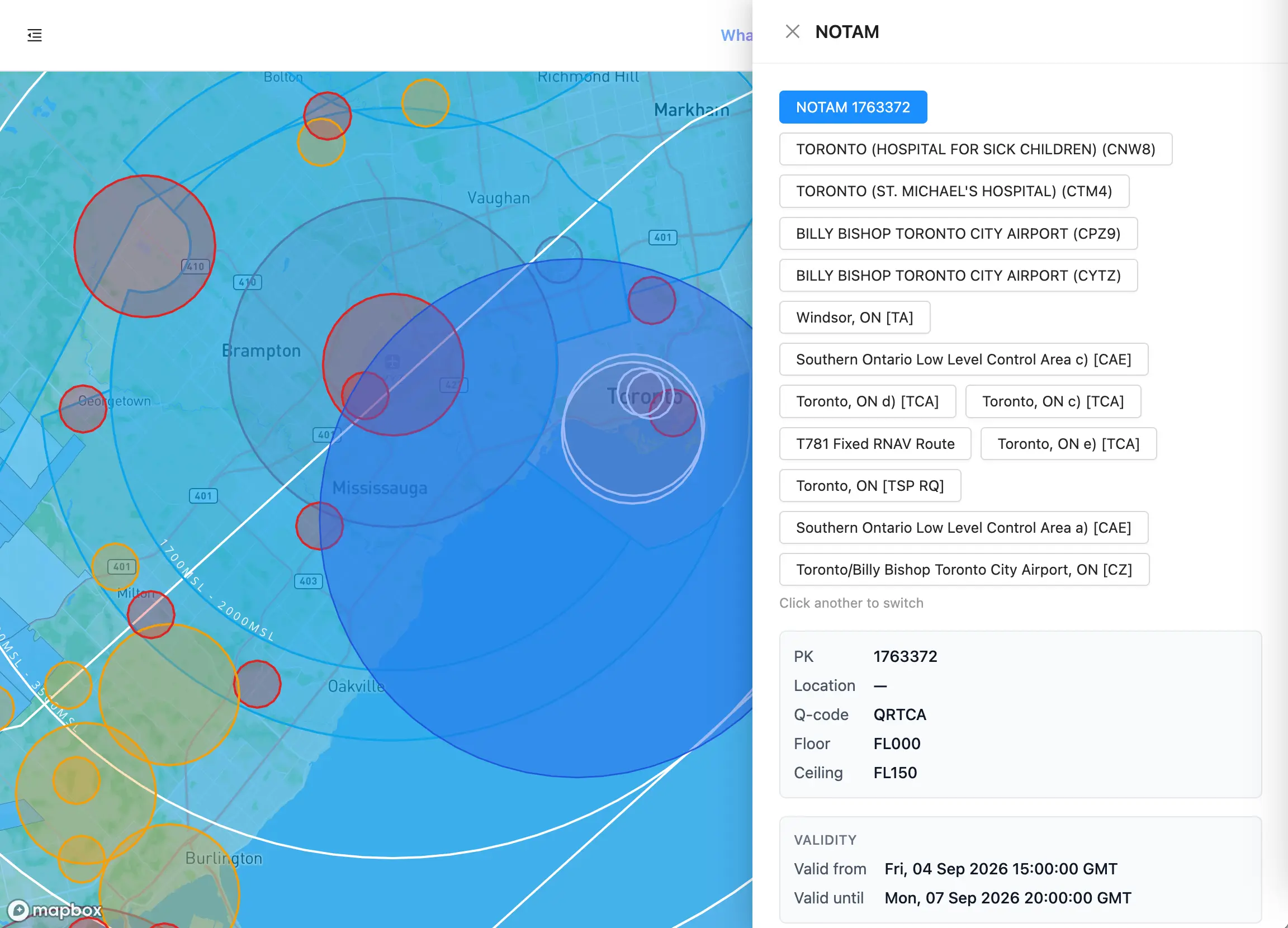
Five features at one point. Each chip is a separate record.
This chip row is the single most useful control on the map. It is the difference between “there is something red here” and “there are four things here, and this is the one with the phone number.”
Aerodromes
The richest panel, split into four tabs:
- Airport — name and identifier, a certification badge, coordinates, elevation, FIR, and operator. The identifier links to that aerodrome’s Canada Flight Supplement entry as a PDF. Runway data is listed when the catalogue carries it.
- NOTAM — currently-active notices for that specific aerodrome, each tagged by category (restriction, runway closure, lighting, navigation aid, and so on) with its validity window and full text.
- METAR — the current observation, decoded into plain language, with the raw report underneath.
- TAF — the current forecast, same treatment.
The METAR and TAF tabs are where plain-language decoding actually happens. Aerodrome weather arrives with a written summary; the map’s NOTAM layer does not — see the next section.
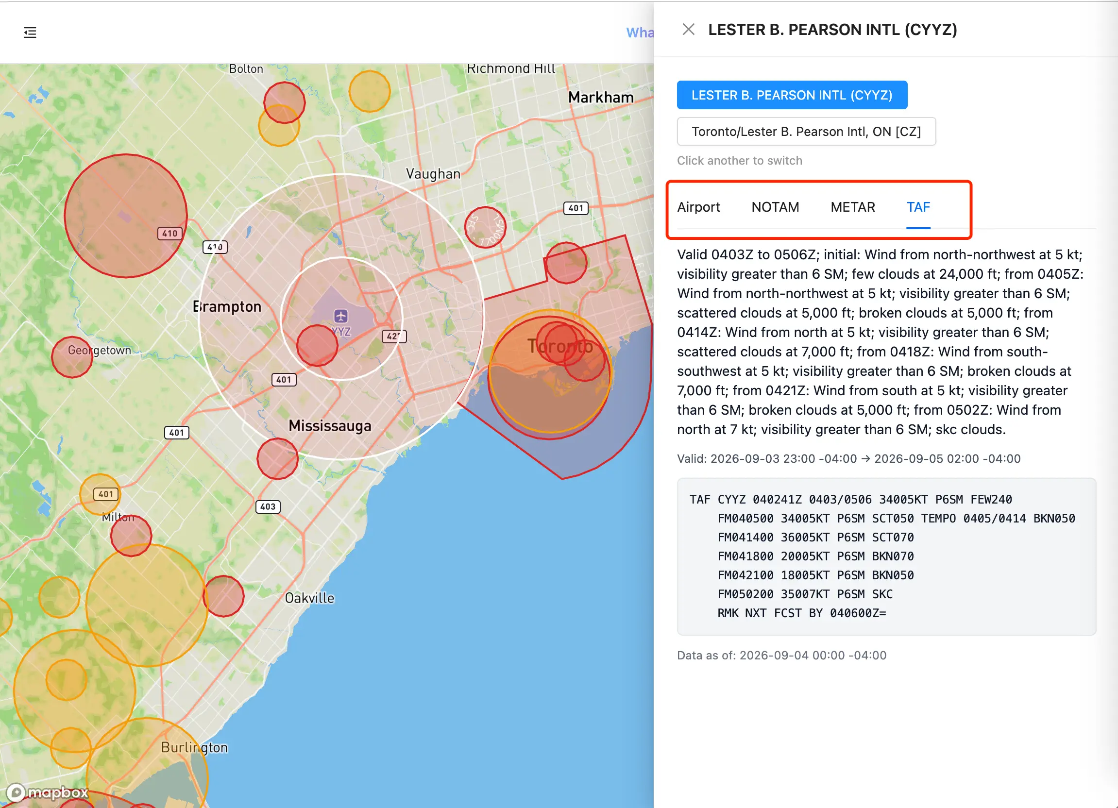
Aerodrome detail. Four tabs, one ICAO lookup.
Airspace
Class, floor, and ceiling, followed by the contact block: User Agency, Controlling Agency, and Operating Procedures.
That contact block is the reason to click a red polygon rather than just avoiding it. Not every airspace record carries an agency entry, but where one does it is the direct route to authorisation — an agency name with a phone number, often a CSN extension, sometimes an email and staffed hours. Phone numbers and email addresses in these fields are rendered as tappable links. Where several agencies are listed, each is shown on its own line.
Operating Procedures is the plain-English rule for that specific block — for example, “No person should operate an aircraft within the area described unless the flight has been authorized by the User/Controlling Agency.”
Airspace records with no agency listed simply omit those rows.
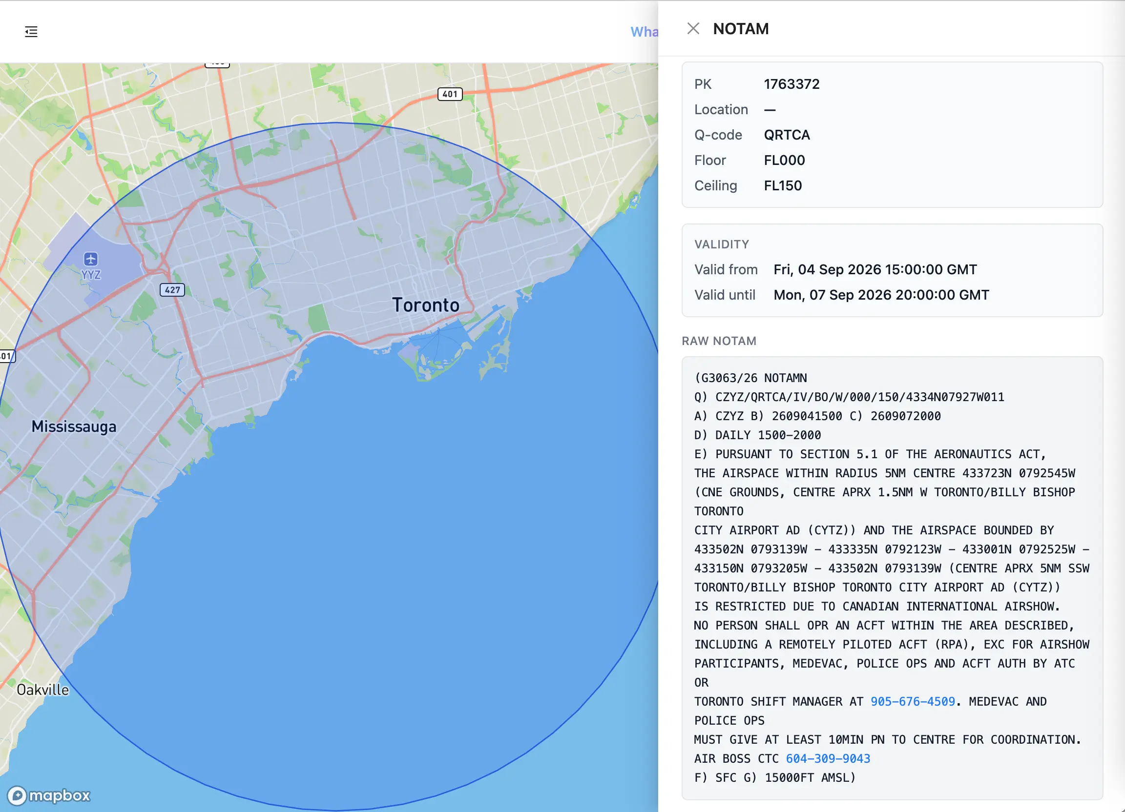
NOTAMs
PK reference, location, Q-code, floor and ceiling as flight levels, the validity window in UTC, and the raw NOTAM text.
Set expectations here: the map’s NOTAM layer gives you the raw coded notice, not a written summary. Plain-language decoding on this platform is applied to METAR and TAF, and to the aerodrome NOTAM tab. For the map layer, you read the source text — which is exactly why we wrote the NOTAM decoding guide.
NOTAM detail. Validity window on top, source text below.
National Parks
Park name in English and French, a designation badge, and the jurisdiction and region. Then a contact card — phone, toll-free number, email, and mailing address, all tappable — and links to the park’s official page and contact page.
Where a park has no direct contact details on file, the panel says so and points you at the official contact page rather than leaving the card blank.
Population Density
Category, population, area in km², density per km², and the dissemination area ID at the bottom. That DA ID is the Statistics Canada identifier, which is what you cite if you need to show your ground-risk assessment to a regulator or a client.
Active Wildfires
Fire ID, area, and the detection window — first and last detection timestamps — so you can tell a fire that has been burning for a week from one detected this morning.
On mobile
The mobile app carries the same nine layers, behind the same Select Layers list. Open it from the map screen and you get the same nine switches — rendered as toggles rather than checkboxes, and listed in a slightly different order than the web legend.
Two differences to know about.
Defaults differ on two layers. Active Wildfires starts on in the web dashboard and off on mobile; NOTAMs is the reverse. Everything else matches.
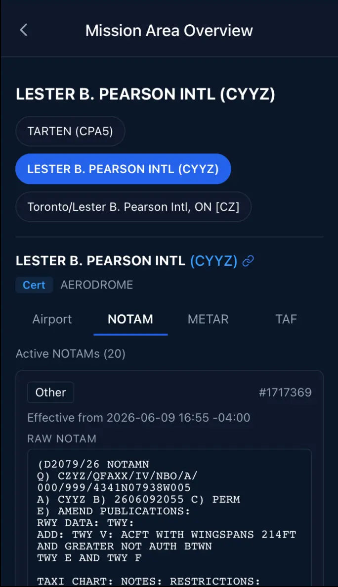
Tapping a layer on the mobile map does nothing. This surprises people who have used the web version. On mobile, tapping the map moves your mission point rather than opening a feature. The equivalent of the web detail panel lives one screen away:
- Place your mission point on the map
- A readiness pill appears at the bottom — Clear to Fly, Caution, or Do Not Fly
- Tap that pill to open Mission Area Overview
That screen has the same chip row and the same six detail panels as the web drawer, including the four aerodrome tabs — plus something the web map does not have: an Advisories list that names the regulation behind each hit. Entries read like “Your flight is in controlled airspace” with the action underneath — “Please obtain RPAS Flight Authorization using the NavDrone app or by contacting NavCanada. (CAR 901.71)”.
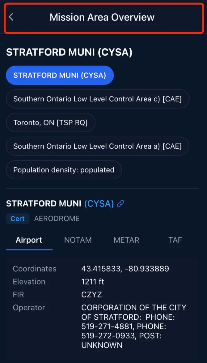
Mission Area Overview. Readiness, advisories, then the feature chips.
There is one caveat on that screen that every mobile user should read, and the app states it directly:
Readiness reflects license and airspace regulations only. It does not consider real-time hazards such as wildfires or NOTAMs — check the corresponding map layers separately.
In other words, a green Clear to Fly badge is a regulatory answer, not a hazard answer. An active wildfire perimeter or a fresh restriction NOTAM over your site will not turn that badge red. Those are layers you check yourself — which is the entire reason this guide exists.
Frequently asked questions
Why don’t I see every NOTAM for my area? The map layer is filtered to restriction NOTAMs that are currently in force. Other categories — runway closures, lighting, navigation aids — are deliberately kept off the map so restrictions stay readable, and they appear in the site survey report instead.
Why does my map look different from my colleague’s? Layer toggles are remembered per browser and per device. Whatever you switched on last time is still on. If you are comparing two screens, compare the legend checkboxes first.
A VNC chart vanished when I panned. Is it broken? No. Charts draw only when the centre of the map is inside that chart’s coverage area. Re-centre over the region and it returns.
Do I need a paid plan for these layers? Two things are gated in the app itself: opening a Canada Flight Supplement PDF from the aerodrome panel, and the Population Density layer in the mobile app. Chart access — CFS, VNC, and VTA — is listed as a plan feature, so check the subscription page in your account for what your current plan includes.
Is this the same as the free map at map.rpaswilco.com? The free viewer is a quick airspace check with no sign-in. The in-platform map adds the full layer set, the feature detail panels, and the connection to your missions, saved geometries, and site surveys.
The bottom line
Three habits get the most out of this map.
Turn on the layers that match the hazard you actually face — wildfires in August, population density for anything near a town, NOTAMs everywhere. Read the colour to narrow the field, then click the shape to find out what it is. And when a red polygon has a controlling agency attached, treat that phone number as the point of the exercise: most authorisations start with a call, and the map has already told you who to call.
Then pair it with a pre-flight weather read and a saved mission geometry, and the whole site assessment takes about a minute.